Context
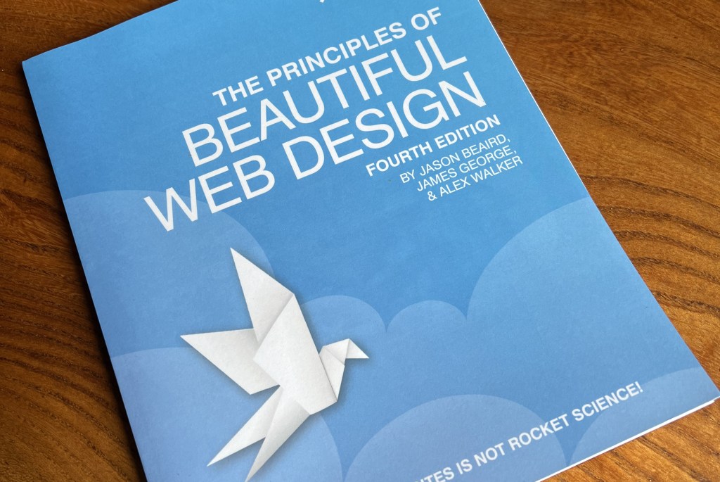
The Principles of Beautiful Web Design had long been a bestseller for SitePoint. While the previous edition was still doing OK sales-wise in print and ebook formats and covered mostly evergreen design principles, some of the example website designs were getting pretty stale. I also thought we could better demonstrate some of the concepts covered by making smarter use of our learning platform. I got the greenlight to update the content, and at the same time got buy-in to adapt parts the content to add interactive features so that it would work well on our learning platform.
My input
- Getting stakeholder buy-in to get the project approved and budget assigned for additional work for the interactive elements
- Commissioning an author and technical editor to work on the project
- Leading the cross-functional team to build out appropriate interactive features
- Managing the project
Examples
Scrolling Image Sections
These were added to show the full extent of website designs, which are often tricky to fit in a typical landscape-format screenshot. Here’s an example:
Visualising Analogous Colours
In the colour theory section, we added interactive tools to make it easier to visualise and play with colour schemes:
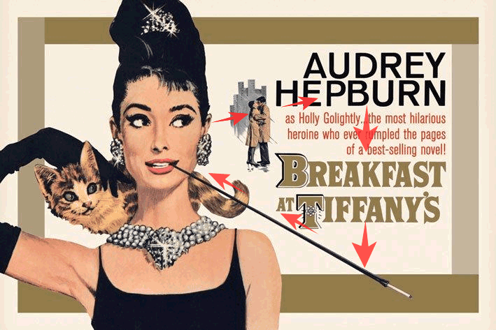
Using Animation to Highlight Design Features
For some images in the book, adding a tiny amount of animation really helped to illustrate the points being made. Here’s an example of a classic movie poster design, illustating how our eyes follow the design elements:
Outcomes
- Delivered on time and to budget
- Great reviews in all formats and user feedback on the learning platform
- The most popular product on the learning platform for several months, driving subscriptions
